Elasticsearch has a pretty awesome highlighting feature, but it comes with a major deficiency. When it truncates your document/string, it gives you no indication that it has done so.
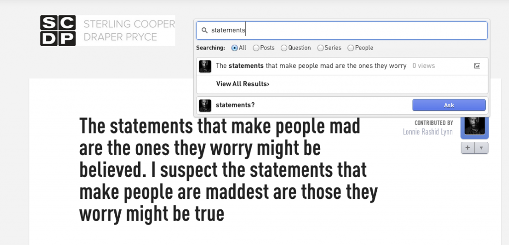
Take a look at this screen shot
As you can see the text (bolded behind the dropdown of results) is truncated in the results in the dropdown itself, but there’s no indication that is what has happened.
Doesn’t seem like a big deal, but for the perfectionists and craftsmen out there, this has to make you itch right? How is someone to know that there is more to that fragment of text that what they’re seeing?
Well, heres some ruby code to the rescue. Throw it in a helper and call it in your view or wherever
1 2 3 4 5 6 7 8 9 10 11 12 | def ellipses_for_highlights(params_highlight, params_original) # have to do this because highlighted stuff from ES has a trailing space for whatever reason stripped_highlighted_item = strip_tags(params_highlight).rstrip # if the beginning of the highlighted text doesn't match the original it has been clipped tmp = params_original =~ /#{stripped_highlighted_item}/ front_ellipsis = tmp != 0 # if the last 10 characters of the highlighted text don't match the original, same deal back_ellipsis = last_string_chars(stripped_highlighted_item, 10) != last_string_chars(params_original, 10) highlighted_item = front_ellipsis ? "... " + params_highlight : params_highlight highlighted_item = back_ellipsis ? highlighted_item + " ..." : highlighted_item end |
to use this, just pass in the highlighted string from elasticsearch and the original string for comparison.
so something like this
1 | ellipses_for_highlights(item.highlight.name.first, item.name) |
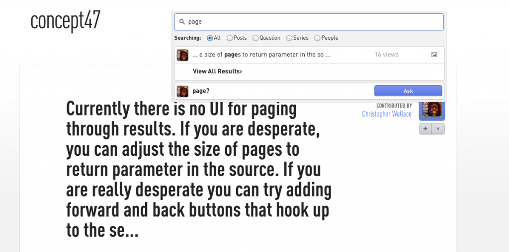
and you’ll get something like this
It will only truncate on the front or back of the string if elasticsearch only truncated at that spot, in addition to truncating on both ends if it realizes that elasticsearch did too. Better, right?
Couple of things to note.
– This will only work cleanly if you have :term_vector set to “with_postions_offsets” in your mapping. This enables elasticsearch break the fragment on words vs truncating in the middle of a word. If you have it turned off (i.e you’re just using the plain highlighter), you’ll get something that looks more like this (notice how the truncation is happening in the middle of words)
– Also keep in mind that because of the behavior explained above when using term_vectors in your highlighting, the fragment_size will not match the number you specify exactly, makes sense (because it has to break on a word which can have be any number of characters in it), but its not described anywhere


