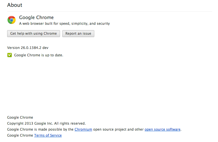
feature I’d love to see: Add What’s New/Changelog to “About Google Chrome” page

This one is really nerdy, but it would be cool if in the “About Google Chrome” page of the browser, a list of whats new or what’s changed showed up right after the version number.

This could be restricted it to only if the user was on the dev/beta channel. I figure if you’re on dev/beta, you care about that kind of information.

Even cooler would be a list of all the versions that you previously used, that folded out on click, so you could see your own specific upgrade path (along with their changelogs)
Adobe Acrobat Reader UI sends mixed messages?

Check this out.

Navigation for Adobe Reader 9

This is the UI for Adobe Reader that you use to Navigate through the pages in a PDF. Clicking the buttons move through the pages one at a time in each direction.

Guess what keyboard keys you have to use to navigate through the pages of the same PDF … the Left and Right Keys!

Very bad dissonance there, because the arrows keep making you think you should be hitting the up and down buttons to move through the pages.
Those icons should be left and right arrows to match the keyboard navigation and send a good visual cue to the user about what keys to hit. #dontmakemethink

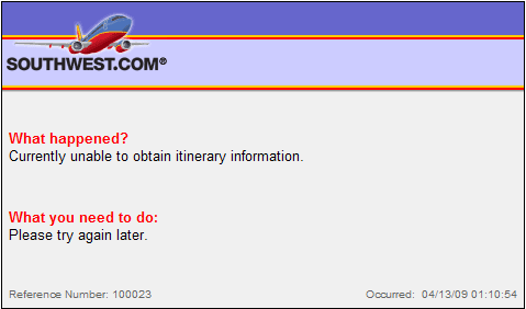
Southwest Airlines error screen fail

cropper_capture_04-13-200901-58-29-am

Looks alright doesn’t it?

Problem is, there are *absolutely* no clickable links on that error message.

Go ahead … try it.

How to fix it?
You need a link back to the home page at least, suggesting other things the user might want to check out is not a bad idea either.
And for style points, a simple text box to get information about what caused the error to happen, will alert you to the problem so you don’t lose prospective customers.

Bad UI design no more … Facebook re-designs their search box …

Boy do I feel special! Regulars will remember that I blogged about the bad ui choice that was made with Facebook’s omnipresent search box a few weeks back.

Well, I went into Facebook today and was prattling off about one thing or the other when my eyes fell on this.

Facebooks new search box

this is what it looked like as of January 9th 2008.

01-09-200802-47-34-pmcroppercapture.Png

As you can see, it would seem that they took my recommendation to add an actual clickable button to the search box, so that mobile phone users could actually use it.

Of course I kid (kinda) about about being responsible for the change. After all why would company valued at $200bn listen to a lowly Austin Web developer with a blog and an opinion. I don’t know for sure, but I’ll claim it … if only for the fact that no one else is:) Steven Colbert did it with Mike Huckabee’s success in Iowa, and I’m doing it here.

Good job Facebook!!!
[Now, if they would only allow embeddable videos in Facebook notes ….]

Nifty web application features and great customer service: unfuddle.com

I spent a good two or three days searching for a good piece of project management software, a few months back. I finally settled with unfuddle. One week after signing up, I was reminded of why I had picked them.

I had been working with on a project and suddenly remembered that I wanted to gripe to them about their user limits, so I went searching for a contact us link … my eyes immediately fell on the link that said “send feedback” … [click on image to see bigger copy]

unfuddle send feedback link

Continue reading

Nifty email application feature: Windows live Mail

This is a neat little feature in the new Windows Live Mail.

windows live mail feature

For those who don’t know, Windows live mail is the Microsoft’s email replacement for Outlook Express 6.

I love this feature so much because now, my email client won’t corrupt my contacts with a ton of useless entries (if you use craigslist a lot you’ll know what I mean).

Its exellent logic, because if I exchange emails with a person a couple of times, then its a pretty good bet that I want that person in my contact list but am too lazy to do it manually.  Now Live Mail does it automagically, so you don’t have to … thats called an “intelligent default”. Makes for excellent application design because it “doesn’t make me think

What would be even better would be the ability to set the threshold number manually.