Nifty web application features and great customer service: unfuddle.com

I spent a good two or three days searching for a good piece of project management software, a few months back. I finally settled with unfuddle. One week after signing up, I was reminded of why I had picked them.

I had been working with on a project and suddenly remembered that I wanted to gripe to them about their user limits, so I went searching for a contact us link … my eyes immediately fell on the link that said “send feedback” … [click on image to see bigger copy]
unfuddle send feedback link

Continue reading

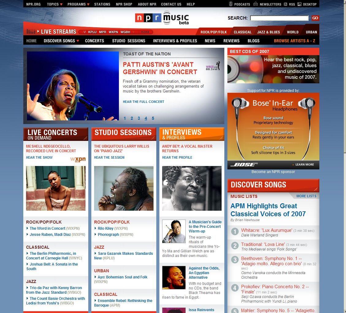
Sites we like … npr music.

Just happened to stumble across National Public Radio (NPR) music early this morning and initially thought it was a redesign of npr’s webite.
It really is visually stunning … a truly great looking site. [Click on images to enlarge]

Npr music homepage lovely colors.

However there are a few problems that I’ve noticed with the homepage design

  • Busy navigation: there too many navigational elements at the top of the page … (almost four different blocks of navigation) which could easily confuse users, Continue reading