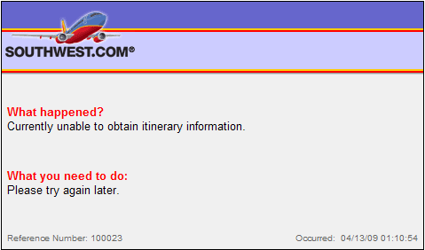
Looks alright doesn’t it?
Problem is, there are *absolutely* no clickable links on that error message.
Go ahead … try it.
How to fix it?
You need a link back to the home page at least, suggesting other things the user might want to check out is not a bad idea either.
And for style points, a simple text box to get information about what caused the error to happen, will alert you to the problem so you don’t lose prospective customers.